

Friday, Feb 9, 2018
The ceramic artist Julia Haft-Candell gave a lecture on Thursday night and then spent Friday with various students looking at and talking about their work. This was the first visiting artist I had look at my work and it was interesting to get a fresh eye and a different perspective.
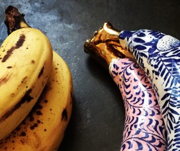
Since I don’t have a studio, I set my pieces up in the glaze room. I chose a few of my older pieces as well as my memory rooms and chairs. I had the tall white vase, the bananas, the totemic piece and the white and green tea set study with the vines wrapping around a small dish. We spent most of the time discussing the more recent work but she was drawn to the totemic piece as well. I really like that small piece; it was a quick study in an exercise about form but the blue and white glaze was successful (in my mind) and it resulted in a piece that is both familiar and odd. It feels good to hold and it’s intriguing to look at. It’s not the best piece but it is a reminder that some of the more intuitive pieces can be good – and fun.
I set up the group of chairs that are made with Dundee Red clay and brush strokes of white slip fired to Cone 6. The result is a dark, rich brown with a faint hint of the white slip. One leg broke off one of the chairs but by chance that chair sits perfectly on the corner of another and shares that leg. It makes for an interesting connection between the chairs. I see the set of 5 chairs as a family; each distinct from one another but all relating to each other as well. Julia liked these pieces and I find that many people do, too.
There wasn’t much conversation about the pieces with decals though she did make the comment that decals are ‘not my hand’. It was a passing statement and I’m not sure how I feel about it in relation to my work. I suppose I agree, but they can also be appropriate to the work and I like them. So, I think I will continue to use them but be aware of how and when I use decals (or rice paper underglazes).
The majority of the conversation was focused on the two memory rooms. Immediately, Julia picked up on something that I had thought about but had a different take. She preferred the unglazed piece, the piece that is finished with the gouache, matte paint because to her it seemed ‘dustier’, like a memory. I thought this was really interesting. She also mentioned that the shine from the glaze was distracting; the light reflecting and the finished look took away from the idea of nostalgia or memory.
Because these are about memory, Julia suggested that I think about the imprecise nature of remembering; was the table here? Or here? by adding multiples of an object. Also, by leaving blanks; letting the viewer fill in more of the scene and questioning what is remembered. This came up in response to my mentioning that I did not want these to look like doll houses.
Julia was also drawn to the abstract nature of the food on the table and thought that was something that could be pushed. She could not read what all the objects were (she saw the plates as pancakes) but that did not bother her, in fact, it made it more interesting. I think viewers are often drawn to objects that are recognizable, but not (like the totemic piece).
We talked about making these pieces more personal but I’m not sure I understand how I can except by recreating specific rooms. I do think these pieces represent amalgamations of rooms but still specific to me. However, I would like to think how I can do a better job with creating spaces that seem more personal. Perhaps more specific objects interspersed with abstract objects?
We talked about the forced perspective (making it stronger, exaggerating it more?) and the possible views around the rooms. What if the viewer were to look through a window? What is happening on the reverse side? Julia like the unfinished, ‘behind-the-scenes’ look of the pieces where the construction is viewed. She suggested I push that further as well.
Some artists she mentioned for me to look at are Pattie Chalmers, Ron Nagel (I don’t remember why – his work seems very different) and Mike Kelly.

Sometimes it just feels good to sit and make shapes and forms in the stoneware, particularly when I’m struggling to find a direction for my work this semester. I have two themes I have been exploring for my classes and the final Post Baccalaureate show this spring. The first is thinking about memory and home, the second is the coexistence of man made structures and nature; the common thread might be the passing of time. When I was making these forms, I was thinking about objects that somehow evoke a memory but also just the form itself – its height, its shape, its texture.

I attended the opening of the Justin L’Amie’s work at PDX Contemporary. I love these watercolor and gouache paintings of flowers and vases. This is a detail of a piece called “The Collector”. They are on the smaller size and have both great detail and abstract shapes. The colors are beautiful and there are little yellow dots everywhere; I think I will re-incorporate these dots into my work too. They seem festive, like bubbles, and circles are often a powerful symbol in any case. I’m drawn to Justin’s images I’m sure because of my attraction to flowers and floral patterns as decoration. Perhaps for my final pieces for this semester I will show flowers as a marker of time; I feel they convey a sense of transiency.. This may also explain my attraction to still life paintings – often famous for their symbolism of time (and decay) though my attraction is not to the gruesome or morbid side.
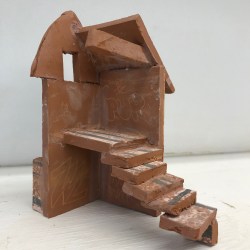
I’m starting to think about what interiors I’d like to work on this semester. I’d like to create at least 6, as I envision 3 rows of two rooms or 2 rows of three rooms on a wall to represent the interior of a house. I’d like to think of spaces that have particular memories for me and perhaps focus again on an object in that space to highlight this memory precisely (as I had in my earlier work). This weird stair interior is an early study of an interior space but not a particular room; I’m just trying to see what that might look like. In this case, I think it needs more mystery such as a cracked door or more of a landing but I do like the strangeness of this view – highlighting an area you might not typically consider. Possibly, I will think about corners, outside spaces and unusual or forgotten spaces as starting point. Or, think of spaces that were filled with life but perhaps are not any more; again, a reflection of time passing.


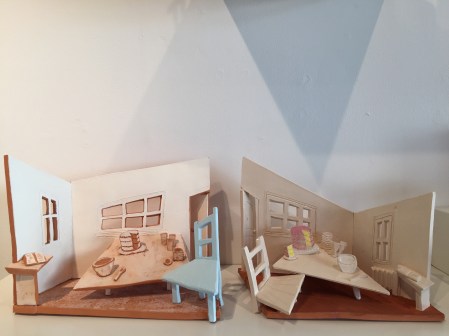
This is an attempt at creating an outdoor space; a covered porch between two parts of a house like a breezeway. I don’t think it’s successful in creating the exact space I wanted to because of scale and lack of information but there are parts that I like. I think the forced perspective of floor and window work, the geranium pot helps as a focal point and the interior room are has some nice elements but I don’t think you can read it all as a whole. There could also be another slab with the view painted on it that you would see as you looked through the ‘breezeway’ which I think could be beautiful. Just not sure how to connect the two.
The photograph from Maine was the inspiration and I still believe it would be a wonderful painting.
I think it’s a good study (and they are fun to make) and I’ll try again. For spaces, it will be imperative to have clear sketches of the ideas and the perspective I want to enhance.
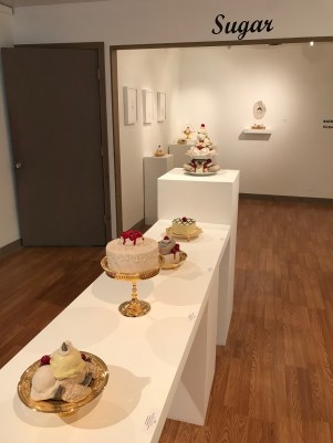
A fun show at Eutectic Gallery called ‘Sugar’ featuring the work of Dirk Staschke. These are super realistic recreations of decadent desserts made of ceramic on gold-plated steel plates and stands. I’ve looked at and studied Dirk’s other work that are still life paintings but in 3D (ceramic). From a distance these still lifes look like paintings but then as you get nearer you realize they are sculptural and the back of the piece is as interesting as the front; the back is the exposed structural components – art in itself. The pieces in this show are from a single piece exhibited before but now pulled apart. Not sure what I think about that – the entire piece was so strong together but I suppose it’s easier to sell parts?
SUNDAY.
No photograph today. Spent the morning at the studio beginning a very large piece and realizing that I am not sure about how to do at all! I do believe that getting the base set will be critical. The scale is so different from what I am used to – it will be a challenging exercise for sure. I have been thinking about floral decoration and what it might mean. I am drawn to the beauty and looseness off lowers and I also like the contrast between their form and the forms that they are usually on, in or around. To me flowers and plants represent the passage of time. I’m thinking, too, of the photographs or images of trees or vines growing up and around objects, usually man made. I’d like to think about floral surface decoration on my ‘rooms’.
Welcome to my final semester as a Post Bacc student at OCAC! It’s been an amazing 2 years (I might just have snuck in one extra semester by auditing Jim’s class – a very good decision on all accounts!). I will be writing about the last part of the journey this spring.
I left last semester thinking about interior spaces. I was thinking about spaces in our homes and the emotions tied up in the memories of those spaces. The spaces I built in clay are corners of a kitchen and in each there is one item that is highlighted. The memory of each is particular but also vague enough and familiar enough for any viewer to relate in their own way. In the final pieces the forced perspective draws the viewer in and it is somehow both inviting and awkward. I think the fact there are no people in the rooms makes them uncomfortable or maybe lonely and yet because there is evidence of recent activity so it’s not so disturbing to me.
I prefer the piece that has a matte finish; I think this makes it look more painterly and is closer to the paintings I was looking at for inspiration. I would like to continue this exploration of dimension and the adaptation of 3D to 2D to 3D (physical to painting to sculpture).
#2 Popcorn

We’ve started our assignment to build an enormous piece of popcorn. I believe the assignment is to force us to really, really look at detail of a small object and also to help us start thinking of building awkward shapes. My piece of (real) popcorn is carefully housed in a small, clear container. Never has a piece of popcorn been so well cared for.
I ‘m enjoying building my basketball sized popcorn. I’m using classroom stoneware which is quite soft and heavy. I think at some point we will learn to make and build paper clay so that the pieces will be lighter. Focusing on such a small object is more interesting than I had imagined and it is amazing how deeply enthralled I have become staring at all the intricate crevices and surface texture.
I have finished building the popcorn and it’s beginning to dry on my top shelf – it’s quite thick and it’ll take a while. I’ll think about glazing it – butter topping anyone?
#3 Presentation
I had a terrible time preparing for my 15 minute presentation for Dylan’s class on Thursday. I’m not sure why it got under my skin but I can only imagine that I was trying to answer all the questions and have a neat and tidy summary of all that I am… quite impossible. It’s my old habit of wanting to know all the answers or being clear about the path toward the goals. I am learning slowly (and happily) while in art school to be more curious and to let exploration be the guiding principle. However, this week all of that went out the window and I got myself worked up with too many images, too many influences, too much, too much… All I needed to do was keep it simple. However, there was something valuable in all the time (hours) spent researching and thinking. All of that time is helping me sort out what is important and what needs to be done in the next few months.
#4


We had a guest presenter in the studio on Wednesday who has been working in the studio for the rest of the week. Tim Kowalczyk is a ceramic artist who produces trompe l’oeil cardboard mugs and other sculpture. He demonstrated his technique of layering incredibly thin layers of clay to create the impression of corrugated cardboard. The trick (or tool), of course, is paper clay (something we will be working in for our sculptures but on larger scale). To me the intriguing idea is using the thin, thin layers to build with. I was introduced to slab building last year and spent a couple of weeks with Ann Agee at haystack learning about intricate slab building and love it. It taps into my love of architecture and building.
#5 Mugs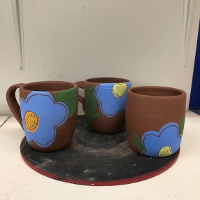
An easy afternoon working on sgraffito and glazing 3 Dundee Red mugs. I needed a moment to step away from sorting out my sculpture class projects and the final Post Bacc show in April. I feel slightly overwhelmed by the projects (and lack of clarity) right now. I only have Feb and March to create something for the show that I will be pleased with and that will make sense… In any case, I worked on the mugs and drew Andy Warhol-Merrimeko like flowers; a lovely blue against the brown of the mugs. I’m not sure what the colors will do after firing but hopefully it’ll work. I guess these are test mugs : ) I do like the way they turned out – I like flowers in or on objects. It’s a good lesson to do what you like to do though that is not always easy with assignments.
Thanks for joining me!
Good company in a journey makes the way seem shorter. — Izaak Walton

Thanks for joining me!
Good company in a journey makes the way seem shorter. — Izaak Walton
